Creating Themes
Themes are plugins that modify the style table. The style table contains style definitions of most UI elements with Lite XL, including syntax highlighting. It can be modified by the user module, a plugin, or a theme file. As Lite XL uses immediate-mode rendering, most UI elements will be updated once the table were modified.
Example: Dracula Theme
This is an example of how a theme file could look like. This Dracula theme is taken from the lite-xl-colors repository.
-- import the style table, and the common module
-- which provides hex / rgb() -> color conversion functions
local style = require "core.style"
local common = require "core.common"

-- set user interface colors
style.background = { common.color "#282a36" }
style.background2 = { common.color "#21222b" }
style.background3 = { common.color "#21222b" }
style.text = { common.color "#7b81a6" }
style.caret = { common.color "#f8f8f0" }
style.accent = { common.color "#8be9fd" }
style.dim = { common.color "#4f5873" }
style.divider = { common.color "#1f2029" }
style.selection = { common.color "#44475a" }
style.line_number = { common.color "#53576e" }
style.line_number2 = { common.color "#f8f8f0" }
style.line_highlight = { common.color "#313442" }
style.scrollbar = { common.color "#44475a" }
style.scrollbar2 = { common.color "#ff79c6" }

-- set syntax highlighting colors
style.syntax["normal"] = { common.color "#f8f8f2" }
style.syntax["symbol"] = { common.color "#f8f8f2" }
style.syntax["comment"] = { common.color "#6272a4" }
style.syntax["keyword"] = { common.color "#ff79c6" }
style.syntax["keyword2"] = { common.color "#ff79c6" }
style.syntax["number"] = { common.color "#bd93f9" }
style.syntax["literal"] = { common.color "#f1fa8c" }
style.syntax["string"] = { common.color "#f1fa8c" }
style.syntax["operator"] = { common.color "#ff79c6" }
style.syntax["function"] = { common.color "#50fa7b" }
When placed into $USERDIR/colors/dracula.lua, the theme can be loaded by using
core.reload_module "colors.dracula" or via the Settings GUI plugin. The theme file is executed as a normal Lua module when applied.
Look-and-Feel
The following sections describe a list of keys in the style table that can be used to customize Lite XL. Plugins may choose to use any of the styles defined in the table for their own purposes, and there are no guidelines for the purpose of all styles defined here. Some plugins may use non-standard names within the style table, so you should consult documentation for those plugins if you wish to modify their style.
Fonts
The following entries define the fonts that are used in Lite XL. Lite XL uses icon fonts to render icons and images in the user interface, and the icon set can be overridden by specifying an icon font that has the correct mapping.
| Name | Description |
|---|---|
style.font |
The font used by non-code UI elements. |
style.big_font |
Larger version of style.font. |
style.code_font |
The font used for display code. |
style.icon_font |
The font containing icons that are displayed in the UI. |
style.icon_big_font |
Larger version of style.icon_font. |
Base Colors
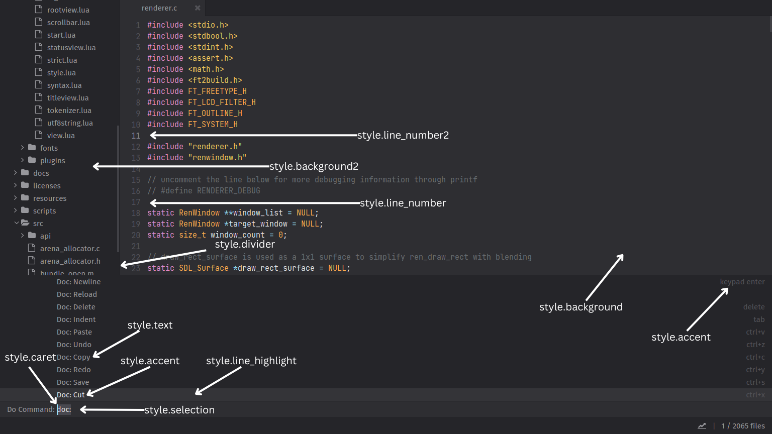
These colors make up the majority of Lite XL's user interface.
| Name | Description |
|---|---|
style.background |
The background color of the editor (DocView). |
style.background2 |
The background color of the file browser (TreeView) |
style.background3 |
The background color of the command palette (CommandView) |
style.text |
The default text color. |
style.accent |
The color for primary (highlighted) text. |
style.dim |
The color for secondary (dimmed) text. |
style.divider |
The color for dividers between views. |
style.selection |
The background color of selected text. |
style.line_number |
The color of the line numbers. |
style.line_number2 |
The line number color of the current line (where the caret resides). |
style.line_highlight |
The background color of the current line (where the caret resides). |
Scrollbar
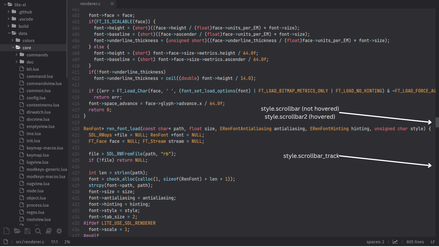
These colors makes up the scrollbar in Lite XL.
| Name | Description |
|---|---|
style.scrollbar |
The color of the scrollbar handle. |
style.scrollbar2 |
The color of the scrollbar handle when hovered. |
style.scrollbar_track |
The background color of the scrollbar track. |
Nagbar
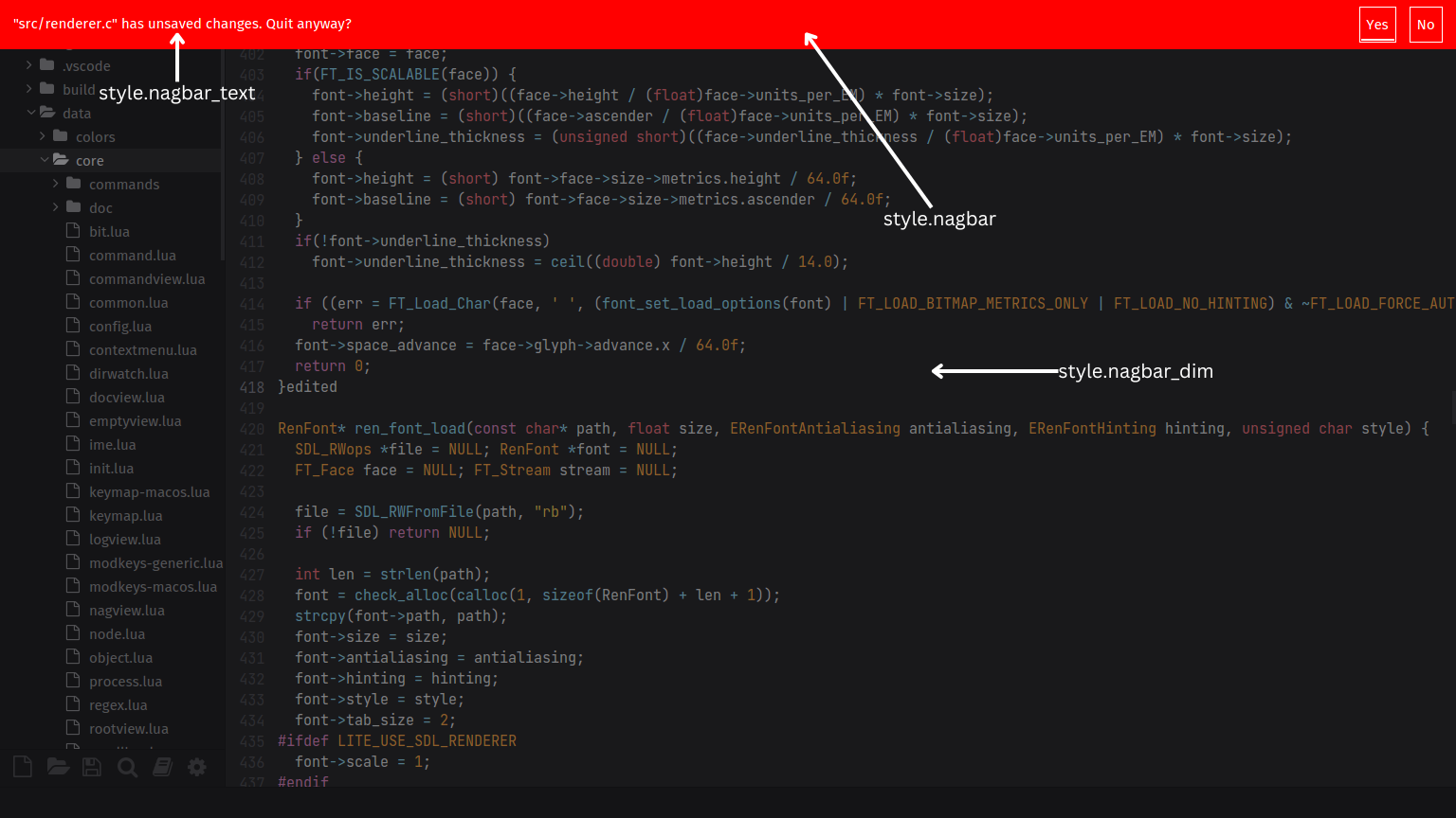
The Nagbar is a dialog interfaced used in Lite XL to convey important choices, such as saving or discarding files when exiting. These colors control the appearance of the Nagbar.
| Name | Description |
|---|---|
style.nagbar |
The background color of the Nagbar. |
style.nagbar_text |
The foreground (text and button) color of the Nagbar. |
style.nagbar_dim |
The overlay color used to dim other parts of the editor when the Nagbar is present. |
Miscellaneous
These colors do not belong to any particular category, but is still used in the editor.
| Name | Description |
|---|---|
style.drag_overlay |
The overlay color covering other parts of the editor when a tab is dragged. |
style.drag_overlay_tab |
The overlay color covering the tab when a tab is dragged. |
style.good |
The color used to indicate a successful operation. |
style.warn |
The color used to display warning. |
style.error |
The color used to indicate an error. |
style.modified |
The color used to indicate a modification has been done. |
style.log["INFO"] |
The color and icon used for displaying INFO entries in the logs. |
style.log["WARN"] |
The color and icon used for displaying WARN entries in the logs. |
style.log["ERROR"] |
The color and icon used for displaying ERROR entries in the logs. |
For the style.log tables, each entry is expected to be a table in the form of
{ icon = string, color = color }, where the icon is rendered from style.icon_font, and the color is applied to the rendered icon.
Syntax Highlighting
Lite XL defines colors for the tokens produced by Tokenizer, which is used to implement syntax highlighting. These tokens are dependent on the syntax files for the particular language, and are intentionally loosely defined.
| Name | Description |
|---|---|
style.syntax["normal"] |
Used for highlighting normal (plain) text. |
style.syntax["symbol"] |
Used for highlighting variables. |
style.syntax["comment"] |
Used for highlighting comments. |
style.syntax["keyword"] |
Used for highlighting keywords (e.g. local, function, end, if). |
style.syntax["keyword2"] |
Used for highlighting a different set of keywords (e.g. self, int). |
style.syntax["number"] |
Used for highlighting numbers. |
style.syntax["literal"] |
Used for highlighting literals (e.g. true, false, nil). |
style.syntax["string"] |
Used for highlighting strings. |
style.syntax["operator"] |
Used for highlighting operators (e.g. +, -, /, *). |
style.syntax["function"] |
Used for highlighting functions. |
Size & Dimensions
The following entries define various sizes and dimensions used in Lite XL's user interface. It's not recommended changing these values unless you know what you're doing.
| Name | Description |
|---|---|
style.divider_size |
The size of the divider between views. |
style.scrollbar_size |
The size of the scrollbar (contracted). |
style.scrollbar_size_expanded |
The size of the scrollbar (expanded). |
style.minimum_thumb_size |
The minimum size of the scrollbar handle. |
style.contracted_scrollbar_margin |
The margin between the cursor and the contracted scrollbar to expand it. |
style.expanded_scrollbar_margin |
The margin between the cursor and the expanded scrollbar to contract it. |
style.caret_width |
The width of the caret. |
style.tab_width |
The width of each editor tab. |
style.padding.x |
The horizontal padding. |
style.padding.y |
The vertical padding. |
style.margin.tab.top |
The top margin of editor tabs. |


